Jul 3, 2025

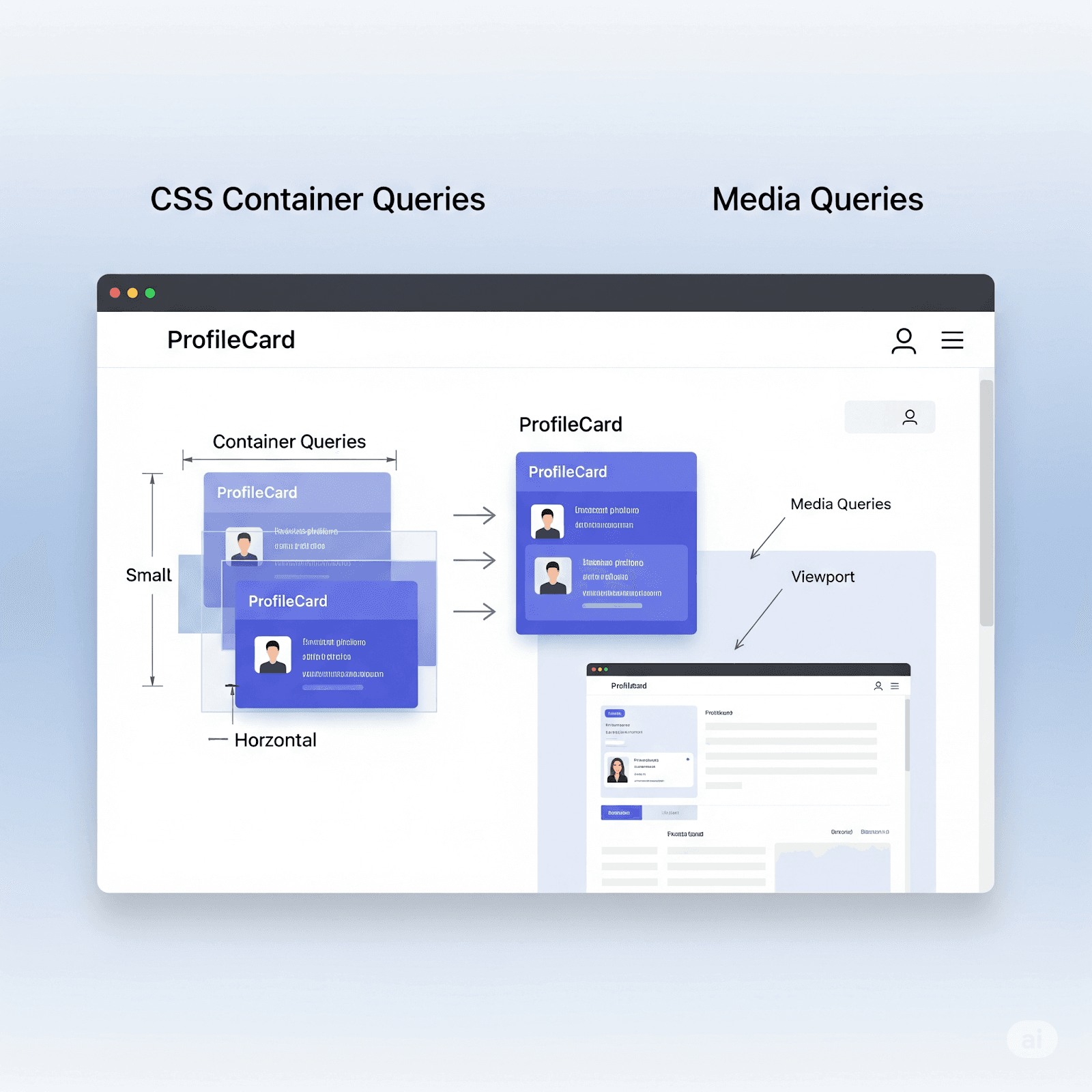
For a long time, the core of responsive web design has been the media query. We've carefully created layouts that adjust to the overall screen size, making sure our websites look good on phones, tablets, and desktops. This approach, focused on the entire viewing area, worked well, letting designs change smoothly based on the whole available canvas.
However, the modern web, increasingly built with reusable parts and organized design systems, brought a new challenge: What if a component needs to adapt not just to the screen size, but to the actual space it takes up within its immediate container? Imagine a "Card" component that looks great in a wide main content area but needs to rearrange itself significantly when placed in a narrow sidebar, or the other way around. Media queries, which are linked to the global viewing area, couldn't handle this component-level adaptability.
What are CSS Container Queries?
This is a groundbreaking CSS feature that lets developers style components based on the size of their parent container. It's a game-changer for building truly reusable, adaptable layouts that fit smoothly into different parts of a page, promoting remarkable flexibility.
Consider these situations:
A Product Card might show its image and text side-by-side when it has plenty of width, but stack them vertically when tucked into a narrower column.
A User Profile Block could display a full avatar and details horizontally in a large introductory section, yet shrink to just an avatar and name vertically when used in a small list item.
With container queries, your components are no longer limited by the entire screen. They become aware of their own surroundings, responding directly to the boundaries of their immediate "box."
How Container Queries Operate
The power of container queries starts with a straightforward declaration. You inform CSS which parent element should act as a "container," indicating that its children can query its dimensions. This is done using the container-type property.
CSS
By setting container-type: inline-size;, you enable the .parent-wrapper element to report its inline size (which, in most horizontal-writing-mode languages like English, means its width) to its descendant elements. Once this connection is made, you can use the @container rule within any child elements to dynamically change their styles.
CSS
Think of it as a localized media query. Instead of @media (min-width: ...), you're saying @container (min-width: ...), but the condition refers to the parent's width, not the viewport's. This allows components to genuinely control their responsiveness.
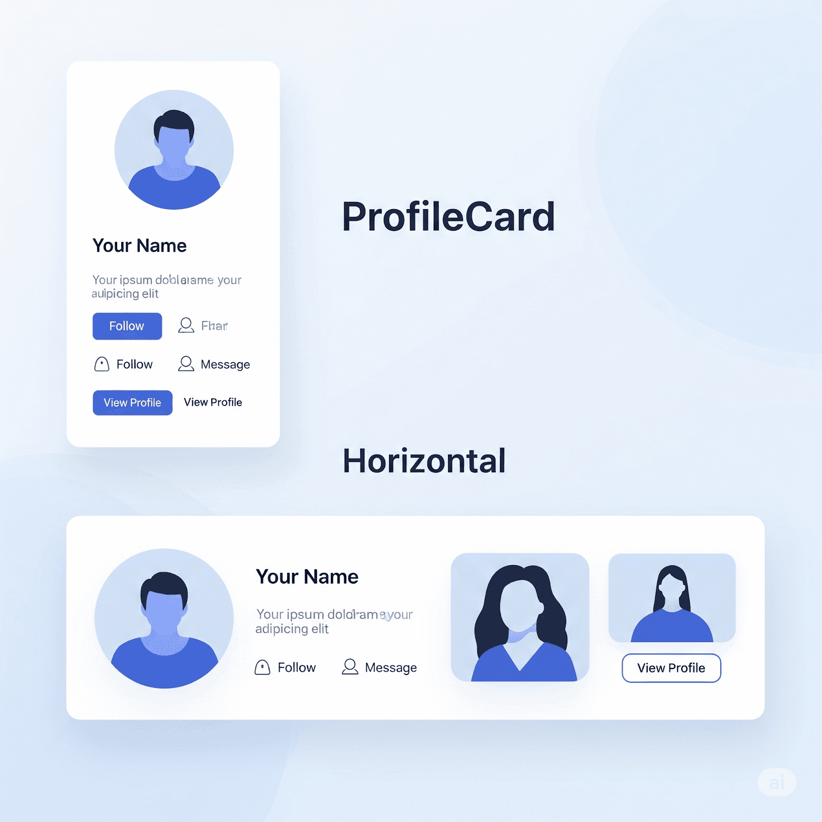
Real-World Example: The Adaptive Profile Card
Let's show this with a common UI element: a ProfileCard component, designed to display a user's picture, name, and bio.
In a small container (e.g., within a list of many cards), you'd want content to stack vertically for easy reading:
Here's the HTML structure for our card:
HTML
This example clearly shows the capability. As the parent .container-wrapper expands beyond 18rem in width, the .card inside automatically shifts from a vertical stack to a horizontal grid layout. This means you can place this exact ProfileCard component into a sidebar, a main content column, or a flexible grid, and it will smartly adjust to the available space without needing specific media queries for each situation.
Naming Containers: Precision in Complex Layouts
By default, an @container query targets the closest ancestor element that has a container-type property set. This works well for simple arrangements. However, in more elaborate layouts where a component might be placed within multiple potential containers (e.g., a card inside a sidebar, which is itself inside a main grid layout), this default behavior could lead to confusion or unwanted styling.
This is where named containers become vital. You can give a custom name to a container using the container-name property. Then, when writing your @container rules, you can specifically refer to that name, ensuring the query targets the exact container you intend.
Now, any component within this .sidebar can target it precisely:
This offers outstanding control, making your CSS more predictable and your components significantly easier to manage, especially in complex user interfaces with multiple nested container contexts.
Quick Tip: For brevity, you can combine both container-type and container-name into a single shorthand property:
CSS
New Units for Container Queries: Sizing by Container, Not Viewport
Container queries aren't just about @container rules; they also introduce a powerful set of new CSS units. These units are context-aware, getting their values from the size of the query container itself, rather than the global viewing area. This offers unmatched accuracy for component-level scaling.
Here are the key container query units:
ese units allow you to create designs where elements within a component dynamically scale not just based on fixed points, but proportionally to the actual space available to that component. This adds an incredible level of fluidity and accuracy to adaptive layouts.
The Impact on Responsive Web Design
The arrival of container queries is more than just a new CSS property; it represents a major change in how we approach responsive design. While responsive web design (RWD) aims to ensure web pages function and appear well across various devices and screen sizes (traditionally relying on viewport-based media queries), container queries improve this by focusing on component-level responsiveness.
Here’s how container queries are changing the landscape:
Enhanced Modularity and Reusability: Components can now be truly self-contained units. Their responsiveness is part of the component itself, making them portable and reusable across any part of your application or even different projects without needing to rewrite or override global media queries. This is a huge benefit for component-driven architectures and design systems.
Simplified Layout Logic: The burden of managing complex responsive designs that account for every possible viewport width is greatly reduced. Developers can shift their focus to how a component behaves within its immediate context, simplifying the overall layout reasoning.
Improved Performance (Potentially): By reducing the reliance on JavaScript for dynamic layout adjustments and minimizing the need for extensive media query overrides, Container Queries can lead to cleaner, more efficient CSS. This can contribute to faster-loading and smoother-rendering web pages.
Integrating with Media Queries: It's important to understand that container queries don't replace media queries; they complement them. Viewport-based media queries are still essential for overarching page layout, setting global typography, and handling fundamental structural changes based on the entire screen size. Container queries, on the other hand, provide fine-tuned control over components within those layouts.
Let's expand our previous example to show this powerful combination:
CSS
This comprehensive example illustrates the powerful interaction between container queries and traditional media queries. The @container rules manage the internal responsiveness of the .card based on its immediate parent's width, while the @media queries handle global concerns like body font size, padding, and the overall max-width of the .container-wrapper based on the viewport. This dual approach gives developers remarkable control, ensuring optimal readability and usability across the entire range of devices and contexts.
Challenges and Considerations
Despite their significant promise, adopting container queries requires developers to consider a few points:
Mindset Shift: Moving from a viewport-first to a container-first way of thinking requires a fundamental change in how designers and developers approach responsive layouts. This might involve re-evaluating existing design patterns and component structures.
Performance Implications (and Optimizations): While container queries can simplify CSS, defining too many overly detailed containers or complex queries across a very deep document object model (DOM) tree could, in theory, introduce rendering overhead. However, modern browser implementations are highly optimized, and the advantages generally outweigh these theoretical concerns, especially with careful planning.
Browser Support (for Edge Cases): Although support is widespread, anticipating older browsers or specific environments without full support means using a progressive enhancement strategy to ensure a consistent baseline experience.
Conclusion
CSS Container Queries represent more than just a new feature; they are a key step in the evolution of responsive web design. They offer a glimpse into a future where web components are naturally more adaptable, layouts are more efficient to build, and the user experience is smoothly optimized across an ever-increasing array of screen sizes and contexts.
Build Future-Ready Web Designs with Superflex
The future of web design is adaptable, and your components should be too. With the power of CSS Container Queries, you can transcend the limitations of traditional responsive approaches, crafting truly flexible and reusable elements.
Ready to empower your designs with unparalleled responsiveness and streamline your development workflow? Explore how Superflex.ai can elevate your web projects today.
